Lanie Vevasis Portfolio 2017
Art Blog
"Dealings with artists requires great prudence; they are acquainted with all classes of society, and for that very reason, dangerous..." ~ Leopold I
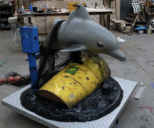 This three-dimensional piece was created by Banksy, a well known yet anonymous English street artist. He is best known for his graffiti that commonly expresses key elements of social activism. His common stenciled work is not seen here however. This is a sculpture made of a recycled kids' playground dolphin as well as several other items that represent trash. This is a statement against pollution and the disrespect of the environment. It has no words, yet it conveys a clear message, making it a strong example of social commentary. 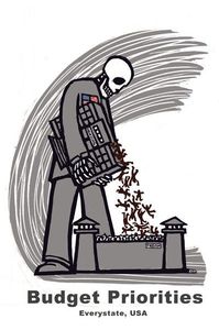 This image was created by a social activist artist by the name of Ricardo Levins Morales. This seemingly simple piece carries a heavier meaning when you look at the words; the building that the skeleton figure is pouring into the jail is a high school, and at the bottom, it says 'Budget Priorities'. This brings to light the uncomfortable truth that the cost of education is more important than the quality of the education/ the environment of the education for most schools in the United States. Besides the message it gives, the art style of the piece is reminiscent of a print (I could not find the original medium for the piece). Some other works that I appreciate are shown below.
From left to right:
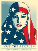
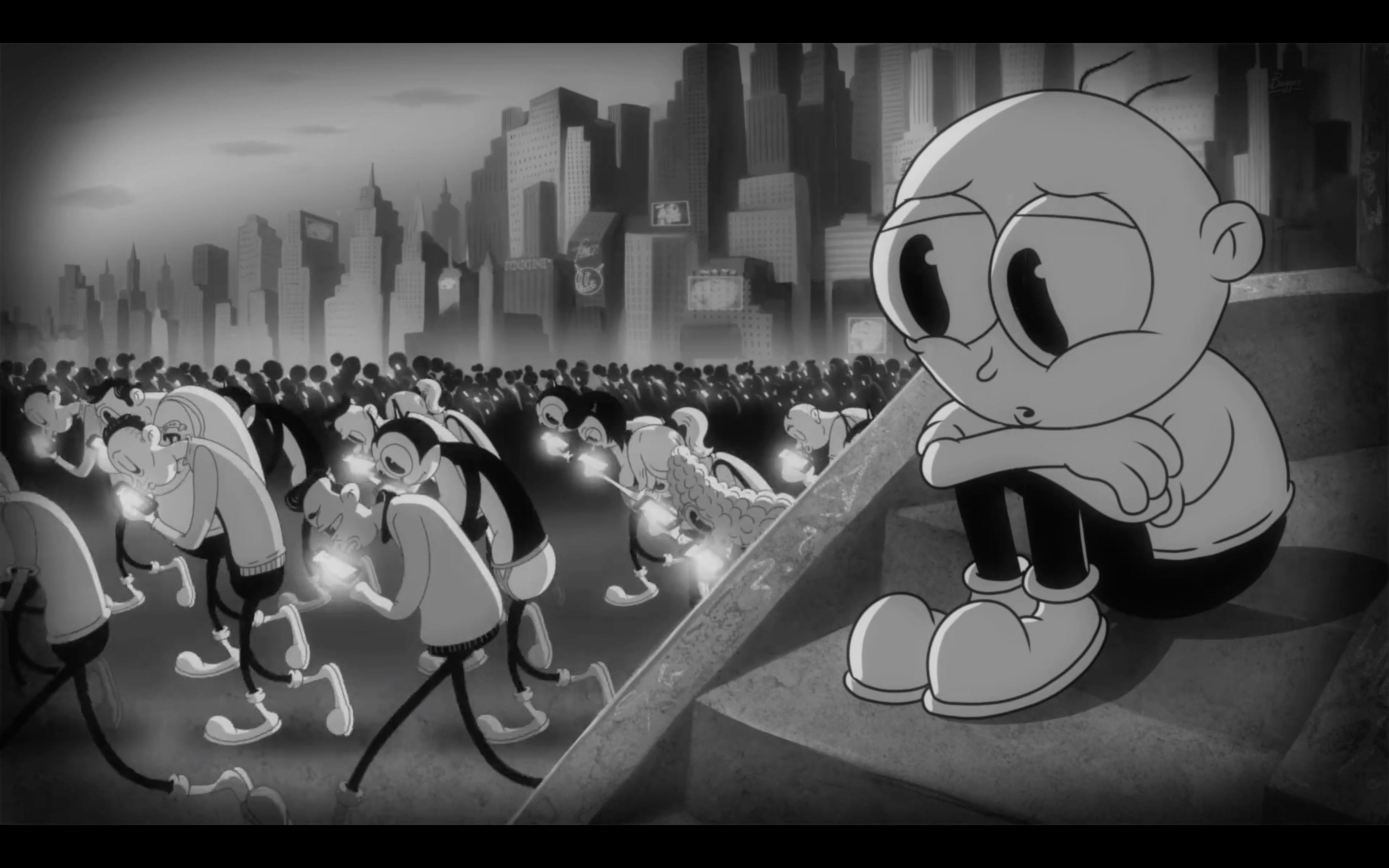
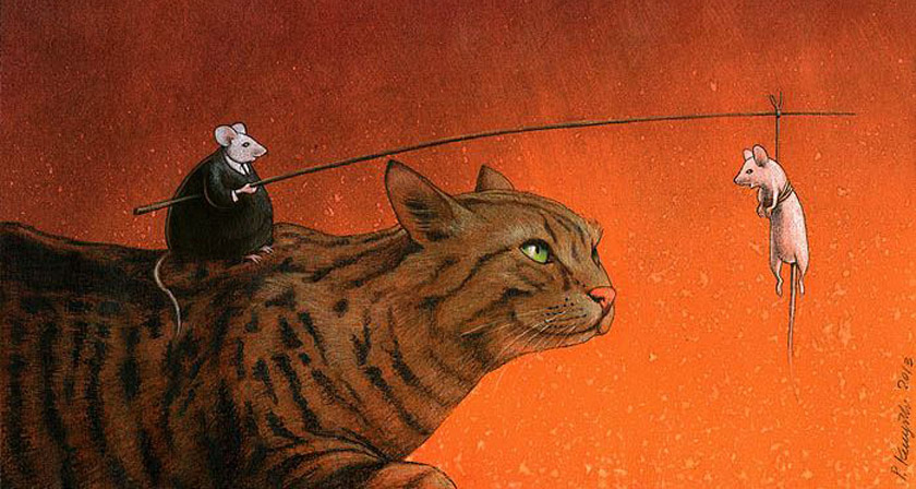
Poster from We The People Series, Shepard Fairey, 2017 Music Video for Moby & The Void Pacific Choir's Are You Lost in the World Like Me? , animation by Steve Cutts, 2016 Artwork by Pawel Kuczynski, 2013
0 Comments
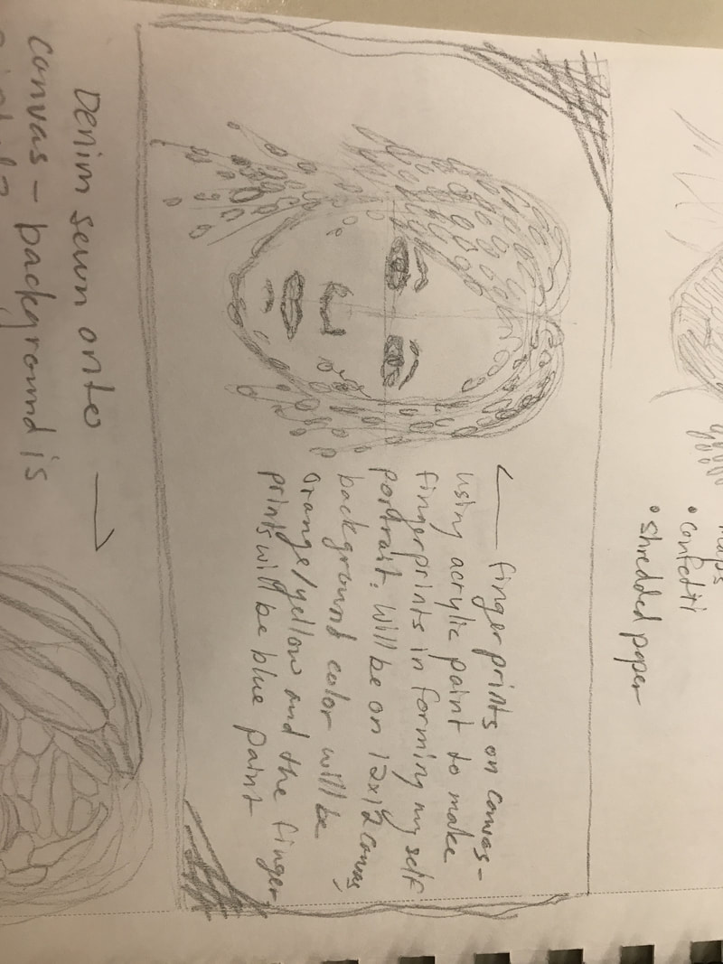
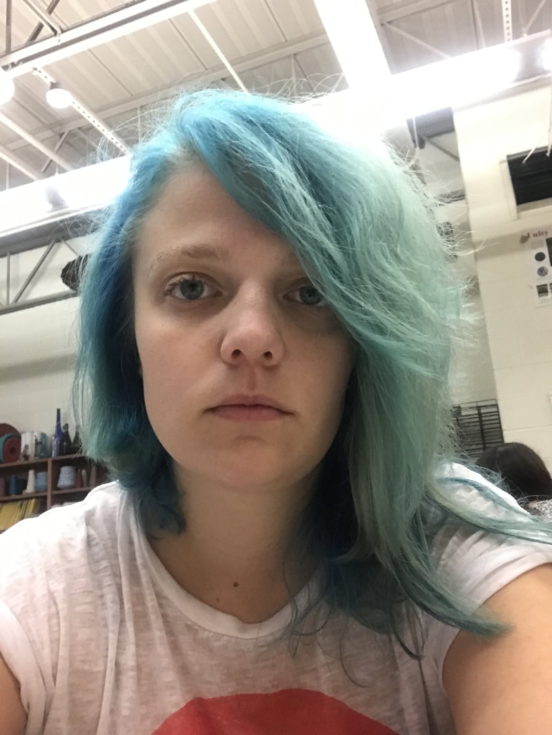
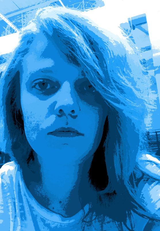
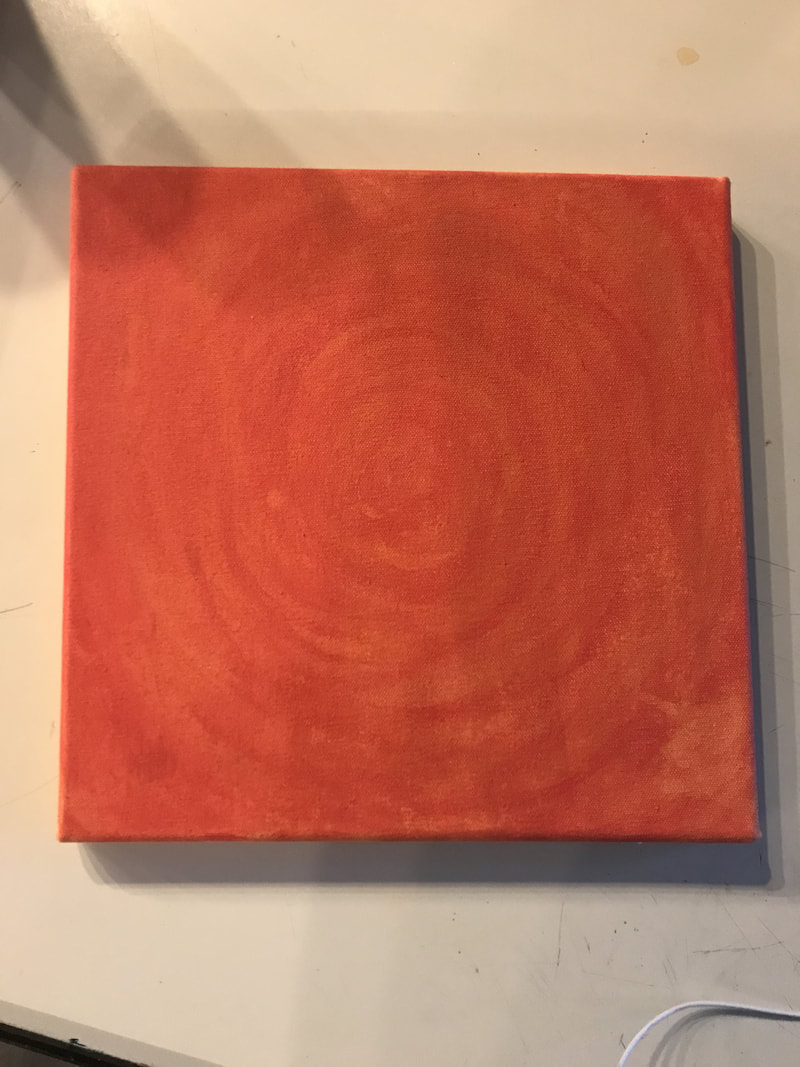
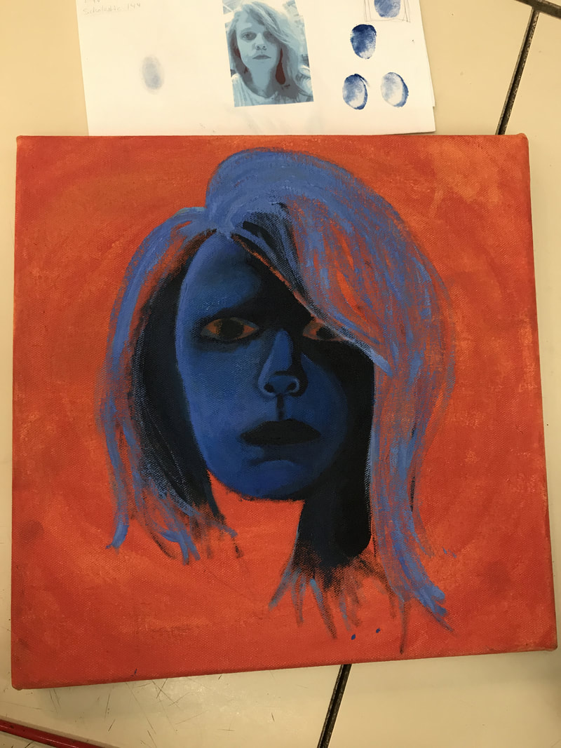
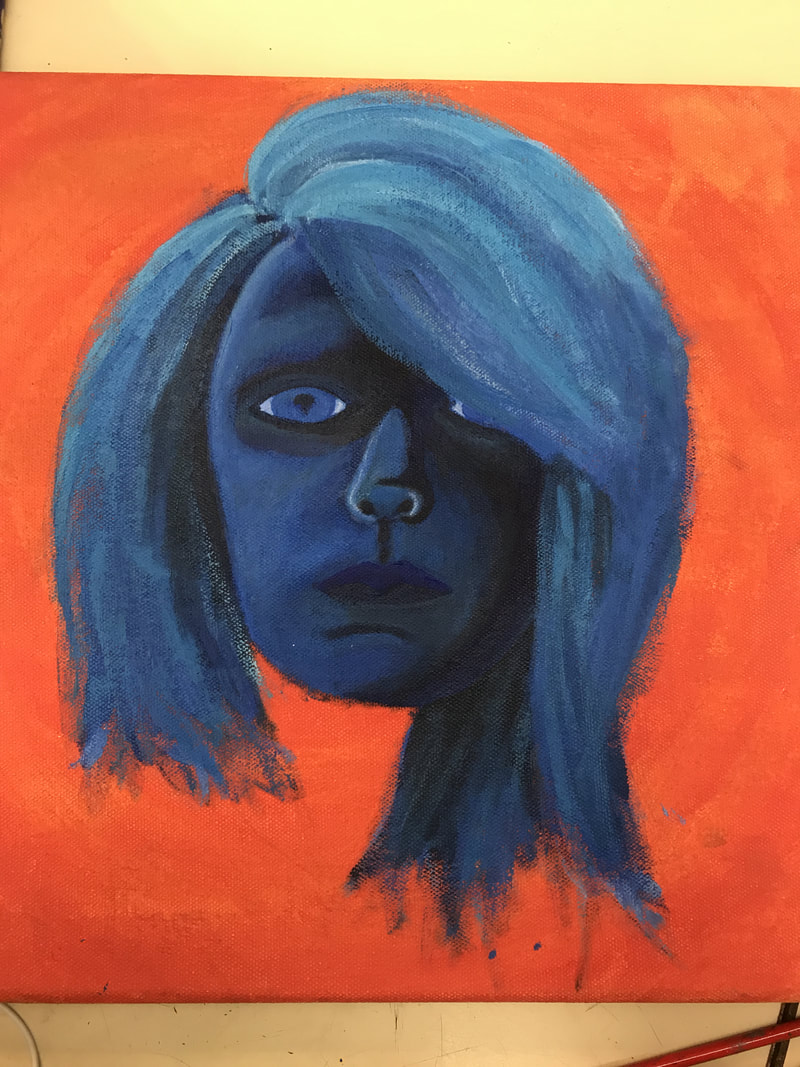
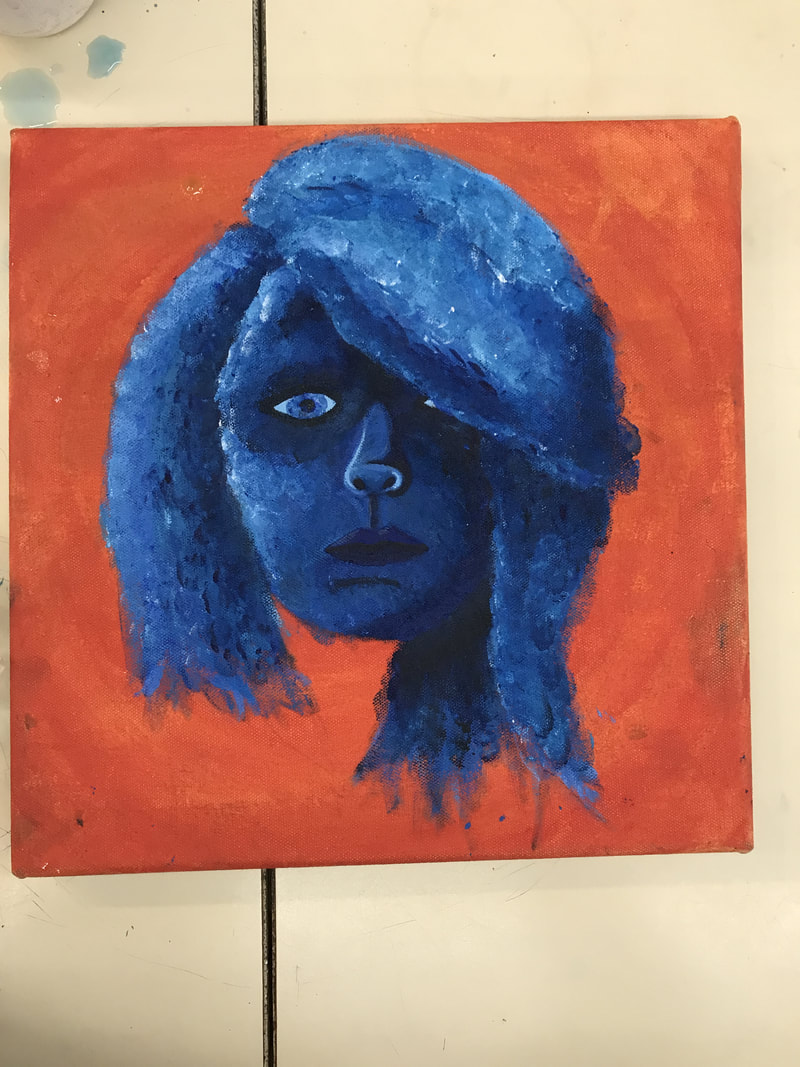
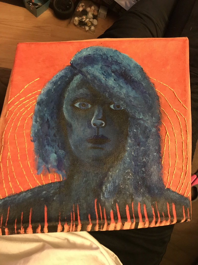
For my self portrait, I came up with the idea of using fingerprints to create my face on my substrate, canvas. I did not want to use traditional flesh tones, so instead, I went with several shades of blue. To accomplish this, I printed a blue, simplified version of my face. I then did an under painting on my canvas orange and projected the blue image to trace onto the background.
Once I traced it, I started to paint in the values of my face before I did the fingerprints (I may have gotten a little carried away...). After the underpainting, I put my fingerprints over the entire face. The lines within my fingerprints did not show up properly on canvas, but if you approach it, you can see individual fingerprints. The facial features, like the mouth, nose, and eyes, were painted with a brush to show detail. Once I completed the painting, I decided to stitch yellow embroidery thread into the background to give the piece more interest. The intention was for the embroidered background to resemble my fingerprint, but it can be interpreted differently as well.
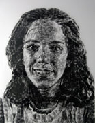
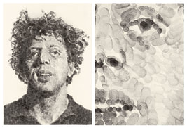
The final result is only slightly different from my original plan, which is a success in my book. I took risks by using materials I am not familiar with; I do not commonly use acrylic paint, and I am new to embroidery. My color scheme was chosen to compliment each other, and it was inspired by my blue hair. In the final painting, the blues were darker than I wanted them to be, but otherwise, I have very few qualms about my piece. If I were to do it again, I would start with the fingerprints instead of the face under painting. Also, if I had left more room, I would have made the bottom into a bar code, to insinuate that our fingerprints are the human version of bar codes. The image below is of my final product, but it lacks the canvas frame. 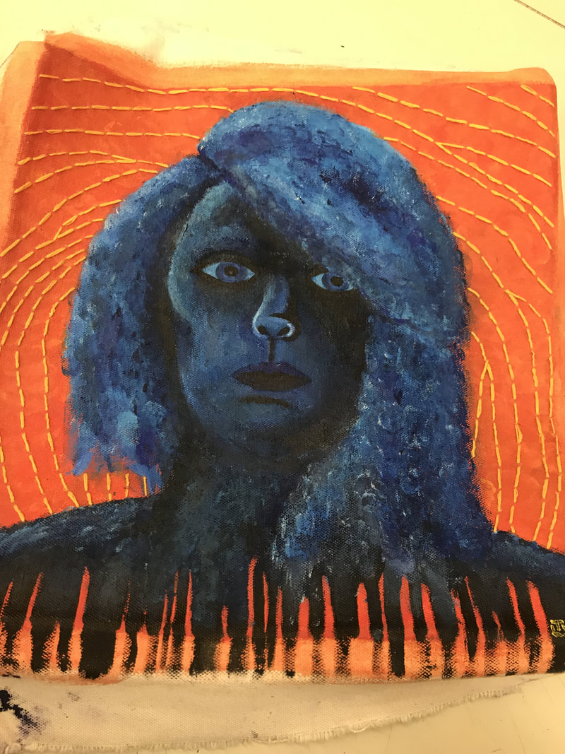 My piece is original, and the only reference I used was my own picture. However, as I progressed further into my piece, I discovered Chuck Close's fingerprint portraits, and I drew further inspiration from those, even though he used ink. I made mine original by using myself as the subject matter, and by using acrylics and thread as materials. Below are some examples of Chuck Close's art:
(From left to right) Georgia (1985), Phil (1979)
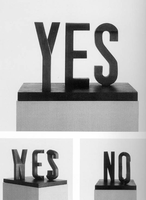 This piece, called Yes/No, was created by Markus Raetz, a Swiss sculptor and illustrator. It is a metamorphosis piece in the sense that if you are standing on one side, the sculpture says 'yes', but if you move to the other side, it says 'no'. I appreciate the effort it took to make this piece look like the actual letters instead of mangled lines that form barely cohesive words. Other than its complex design, its color is just plain black to emphasize the simplicity behind these two words despite the large impacts they can have. 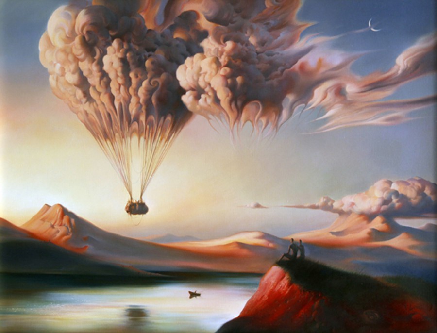 This painting was created by Russian surrealist painter and sculptor Vladimir Kush. This piece, aptly named Metamorphosis, portrays a cloud that acts as a hot air balloon. The transition from the cloud to the cords of the balloon is fluid, which gives the piece good cohesion. I also like the dulled colors and the two onlookers that are not the main focus of the piece, but they add interest as well as a story. This is a painting I would hang on my wall, because at first glance, it is a simple piece. However, upon further inspection, it is a highly detailed surrealist work.
|
Lanie Trudiana VevasisI am a current Junior at Shippensburg High School that loves all aspects of art. I am in no way an expert; however, I am constantly looking to expand my knowledge and experience. Archives
January 2018
Categories |
 RSS Feed
