Lanie Vevasis Portfolio 2017
Art Blog
"Dealings with artists requires great prudence; they are acquainted with all classes of society, and for that very reason, dangerous..." ~ Leopold I
|
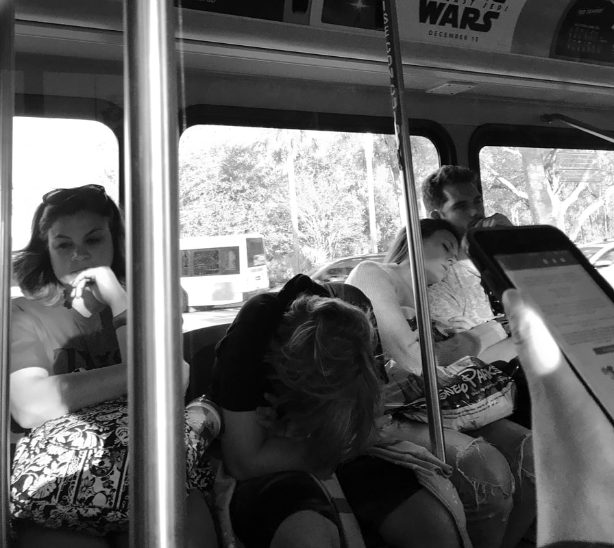
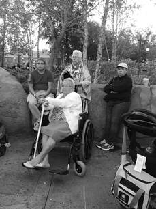
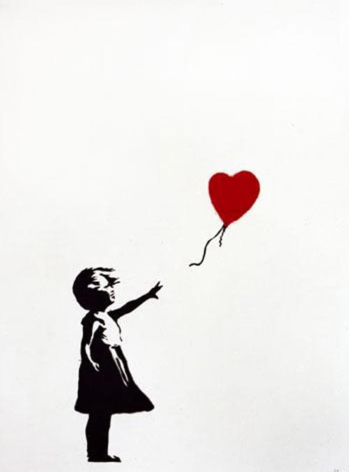
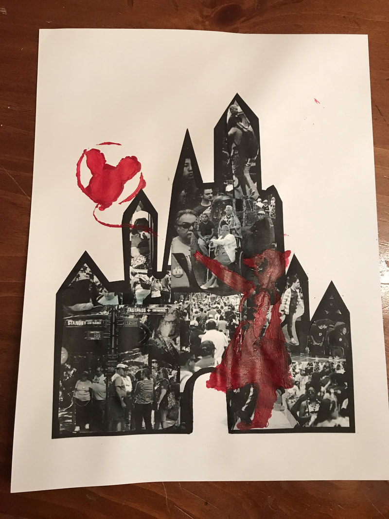
November: I do not have completely fleshed out ideas of my next three projects, but I have a good sense of what mediums with which I want to work. ~Encaustics ~Printmaking ~Photoshop For my third idea, or third theme, I want to do another social commentary piece. Even though it has been awhile since a large oil spill plagued the news, it is still a visible reminder that we must keep our environment clean. I had the idea to create a diorama of a beach, but with sea creatures and birds that are beached and covered in oil. For the base, I would use a piece of wood. I can use real sand to recreate the beach, and I thought of using shredded/cut blue water bottles for the ocean. The animals would be smaller, only a little bigger than a quarter for most of them, so air-dry clay may be the best route. Finally, for the oil, I would use black, blue, and purple encaustic wax to create the illusion of real oil. 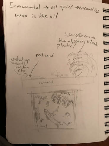 I had also thought of doing photography for my next project. Over holiday break, I am visiting Disney World, or the so-called 'Happiest Place on Earth'. I would do a series of photos featuring not-so-happy families on their vacations. I also considered doing a print inspired by my travels, but, as I stated earlier, I do not have everything pinned down yet. These are simply a few brainstorms for my next endeavor! December: Observation!For this project, I had the idea of taking pictures in Disney World on my trip from late November to early December. I did not catch many quality photos using my iPhone 7 plus (the camera doesn't live up to expectations), but the pictures I took could serve as the background for my idea of a print. The print was going to be inspired by Banksy's Girl with a Red Balloon. I quickly changed my mind about the use of printmaking for this, and instead settled for a stencil, more in tune with Banksy's art. I combined the photos of crowds in several Disney parks or the background in the generic shape of the Disney castle using an app similar to PhotoShop. On top of the crowd images, I displayed my better photos, some of which are seen below, as a collage. I edited my photos using this app to make them grayscale to allow the viewer to focus on the forefront, the stencil, not a distracting colorful background. Besides the grayscale, I wanted my pictures to be natural, and I took them discreetly to ensure the image of the authentic theme park experience. Along with the prime examples of my pictures below, I included the inspiration for my stencil:
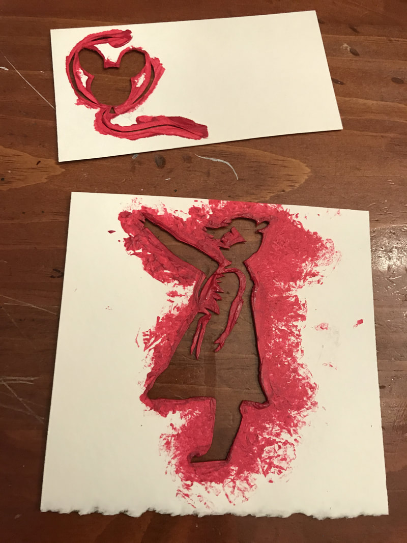
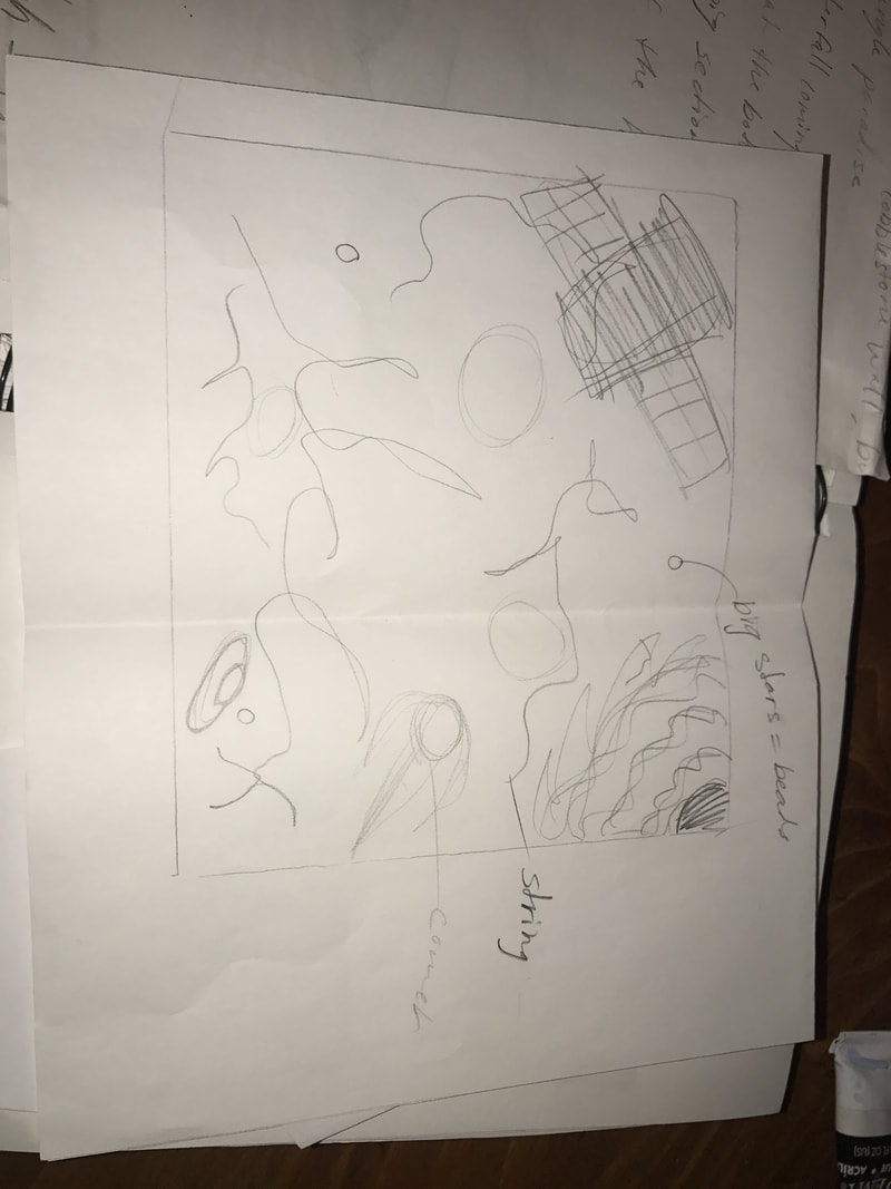
My original plan for this project was remotely different; it was going to focus on the capitalism of Disney over the concept of happiness. I was going to make a print of a one hundred dollar bill with Mickey Mouse's face, and then still feature a crying child whose tears become the money. You know the phrase, 'money can't buy happiness'. This concept was trashed because there was too much going on, and the viewer would struggle to focus on the true meaning behind the art. Here is my original sketch: 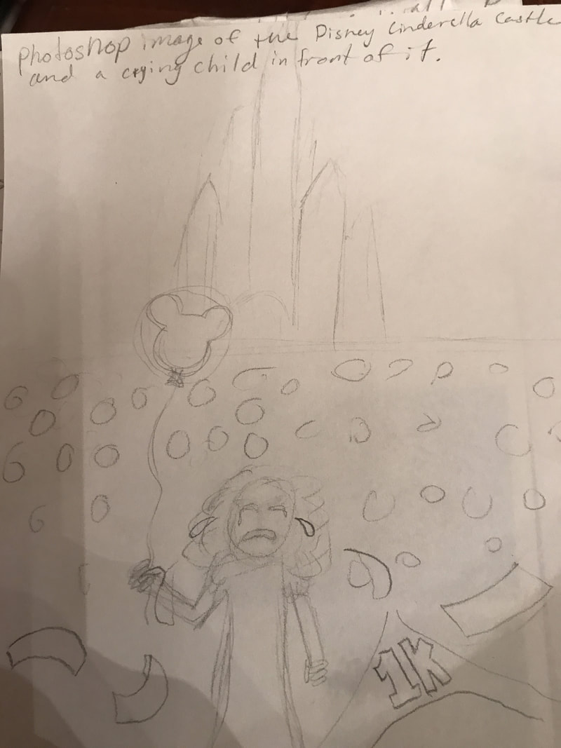 The stencil for my new plan was the girl with the balloon, but the girl was wearing Mouse ears, the balloon was a Mickey balloon, not a heart. This is a subtle change which really implies the meaning behind the piece. However, the viewer can still interpret this piece as a metaphor for capitalism (those mickey balloons aren't cheap) or just another piece of anti-Disney propaganda. The title for this is "The Unhappiest Place on Earth". I have used red acrylic paint to create emphasis on the stencil. I need to add another layer or two to embolden the stencil. Here is my current state:
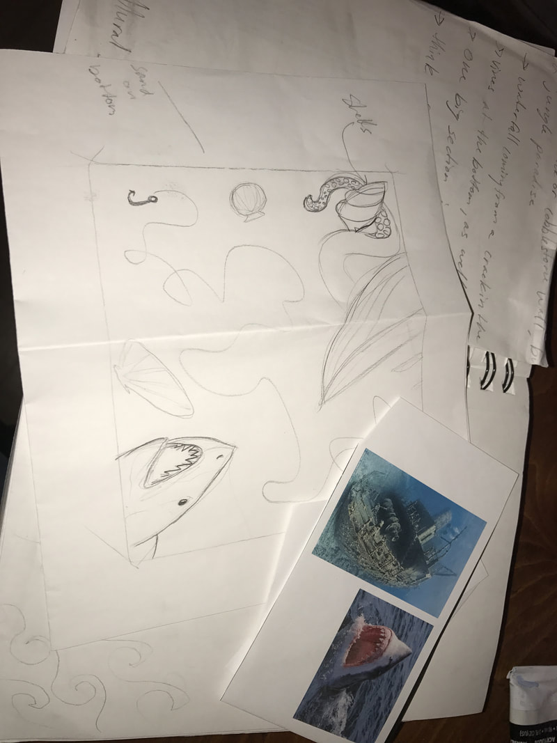
Update: I changed the colors! The black was too saturated and distorted the images within the castle. Instead I went for a lighter blue for the castle, I made the girl in black, and the balloon in red. I placed these on a black background which really brought out some depth within the piece. Over all, it became my favorite finished piece. 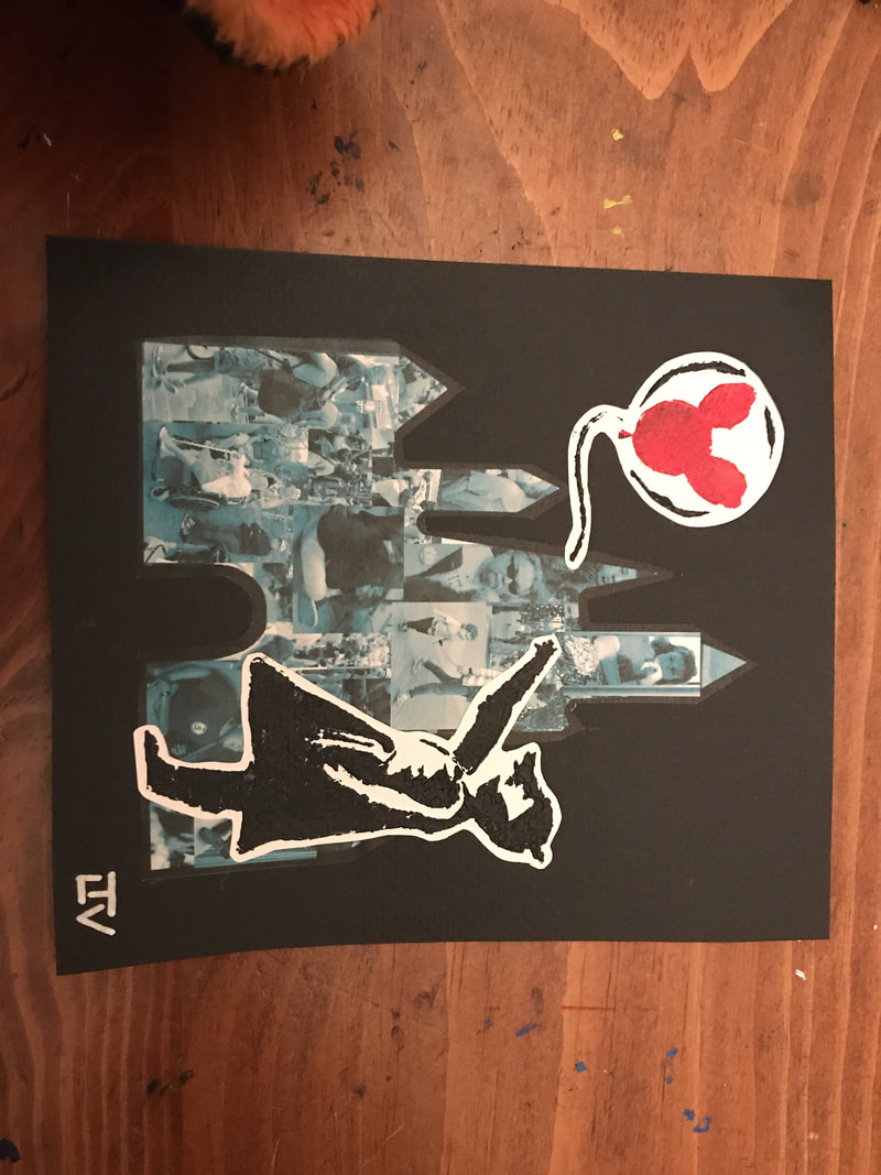 Opposing Places!This project is my first chosen theme, opposing places. I first had the idea of doing another social commentary, and utilizing encaustics to represent an oil spill. However, my second idea appealed to me more, thanks to its concept of opposition and, in a way, competition. Space has nearly always been referred to as 'The Final Frontier', but we have explored less of our own ocean than we have our solar system. Therefore, the ocean is the true 'Final Frontier', although it is not recognized. I wanted to do an encaustic diptych, with one representing space, and one the ocean. I would print out images similar to the ones in the sketches: a satellite, a shark, etc., but I would also draw a quick sketch of one of the objects to make the piece more 'my own'. The drawn item for the space is a UFO, and for the ocean, it will be an octopus tentacle.
This was my first experience using encaustics. Although I did enjoy the form of art, the smell of the wax gave me a migraine which sent me home for a few days. I completed one of the pieces, the space one. I first did a layer of a dark colored wax to imitate space. On top of that, I placed some wool from orange yarn to create a galaxy effect, as well as a few silver beads to act as stars, and covered it with translucent wax. I then played with splattering color to create a sort of nebula-cloud look. I then took my images and placed them in between layers of the translucent wax. On the top layer, I added more color to avoid an issue with the depth of the images in the wax. Using the opposite end of my brush, I made indents on the wax to emphasize the images. Below is the completed product for space: 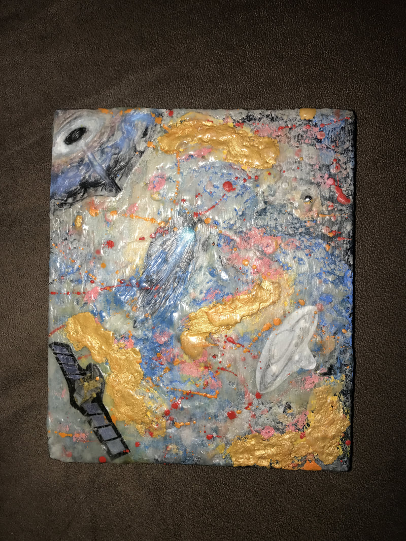 As for the ocean-half of the diptych, I am thinking about possibly making a collage instead of another encaustic. I do not want to risk another migraine, and for cohesion, I think collaging would be my next best option. Update: I created the ocean half using a block of wood, collaged paper, paint, and sand. I wanted to give a similar, mysterious look to the space piece. 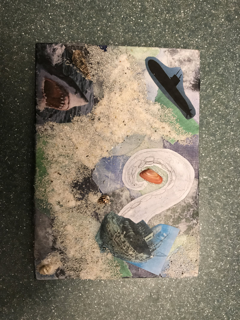
0 Comments
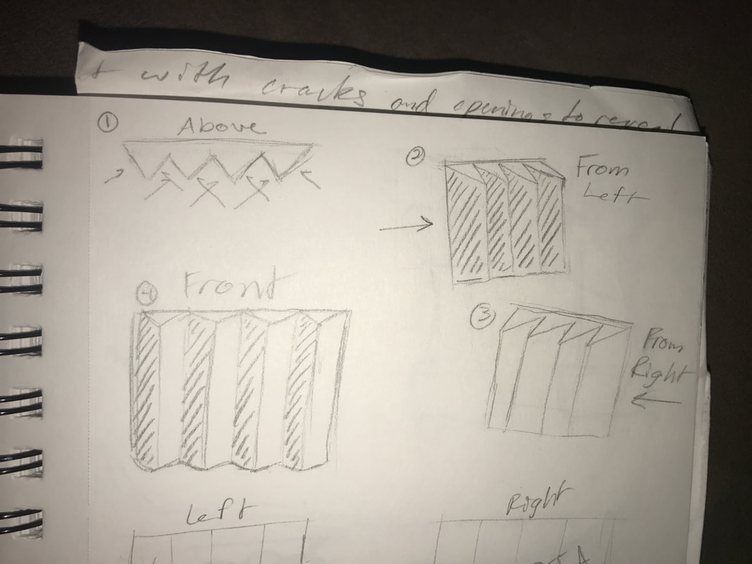
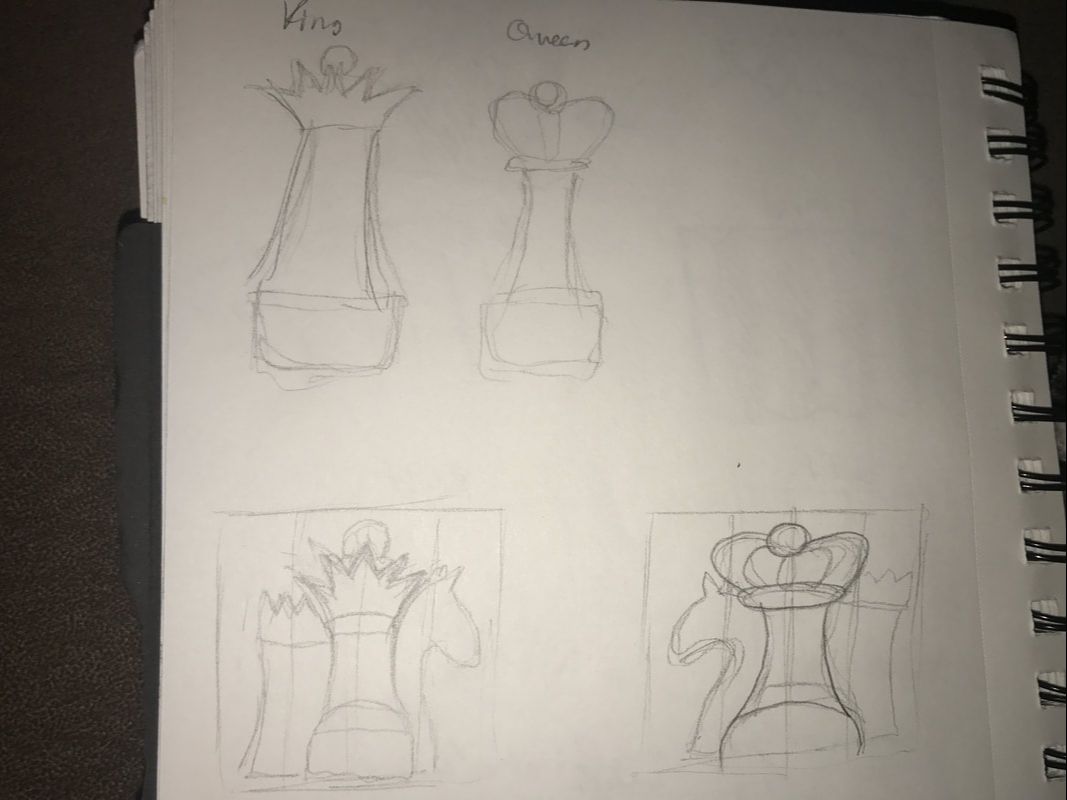
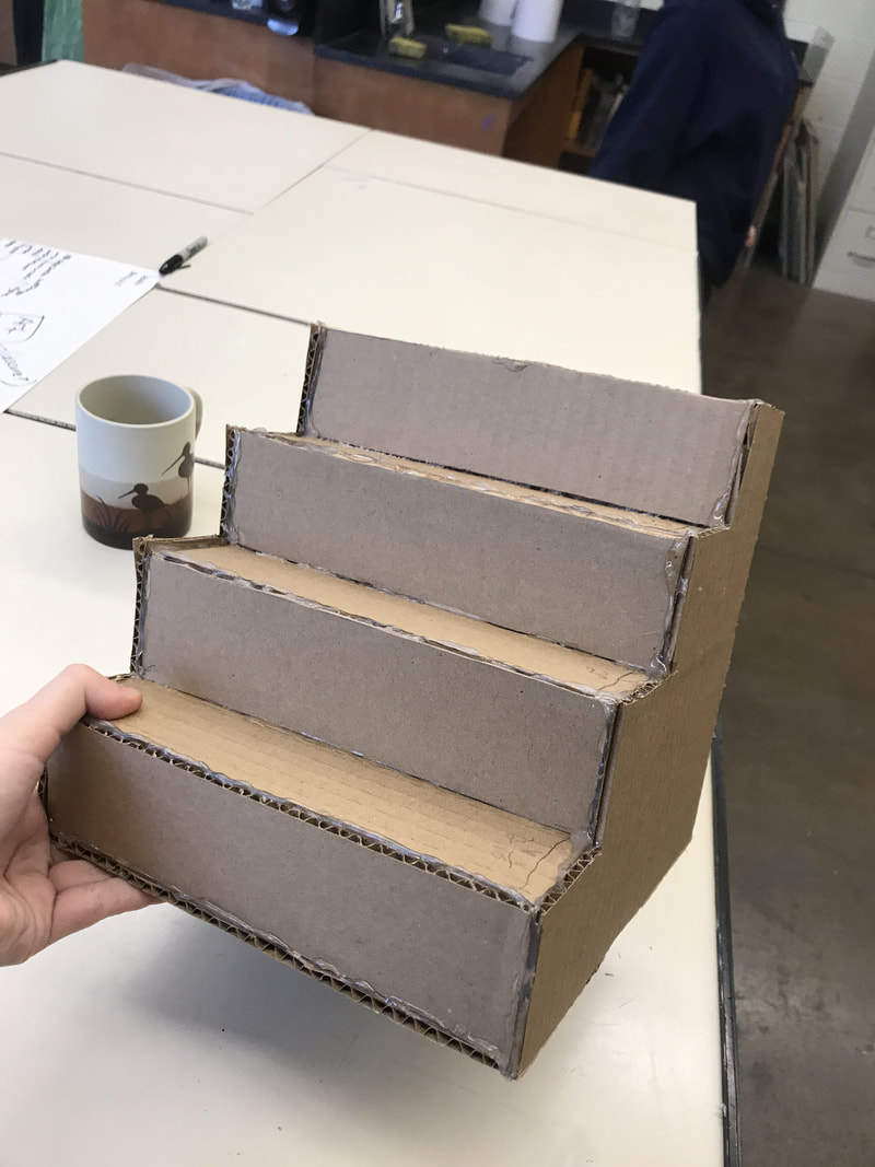
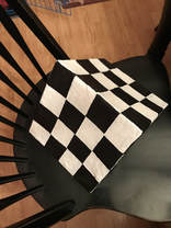
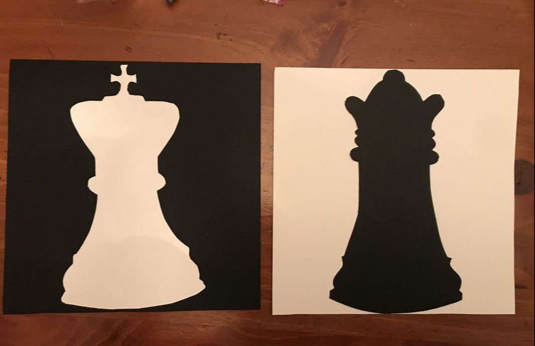
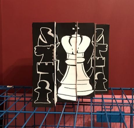
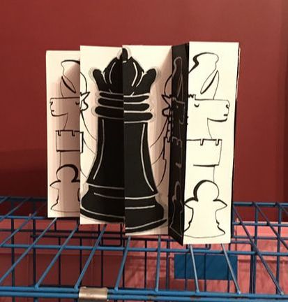
In my independent study, I was given three topics and left to decide two more for myself. For my first two topics, I went with two given themes: perspective and identity. #1: Perspective!My first project represents the theme of perspective. It is a three-dimensional piece with two-dimensional images. It is an object that resembles a set of stairs laid on its side; from the left, you will be able to see one image, and from the right, another image. The images will be of chess pieces: a black king and a white queen. Along with the theme of perspective comes the theme of opposites due to the juxtaposition between both the colors (black and white) and the objects themselves (king and queen).
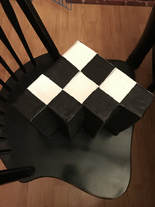
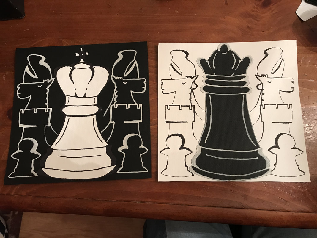
So far, I have created the base out of cardboard, with four panels for each image. I then decoupaged some brown paper bags with a glue and water mixture. Next, I will paint the base black, then add a chessboard pattern. I will create the images of the chess pieces using cut gray scale paper and an X-acto. I will then cut the images into four strips each using an X-acto, and adhere them to the base. When finished, this piece should be interesting to look at from all angles, even the sides with no chess pieces. Update: As of the week before Thanksgiving break, I have most of this first project finished. I have painted the checkers, using painter's tape for precision lines. I painted the checkers on all faces of the base besides the front where the images will go. I also cut out the shapes of the king and queen chess pieces. I will eventually use cut pieces of gray scale paper to add accents on the chess pieces. On the plain black and white backgrounds, I hope to draw a pattern of smaller chess pieces (knight, bishop, rook, pawn, etc.) to alleviate some of the negative space. Once I finish that, I will only need to cut the images of the chess pieces into four panels, and then glue them to the 'stair' base.
Update #2: I am finished with the project, and I am satisfied with the result. The view of the pieces is a bit wonky from the front, but overall, it portrays the correct image on both fronts. Pictured below is the finished king and queen images, as well as the final result of the double-sided piece. The title is officially 'Checkmate', a blatantly obvious reference to chess that can even be respected by those bored of board games. If I were to change anything, I would try to make my cardboard measurements even more precise, because the paper goes slightly over the edges on some of the panels.
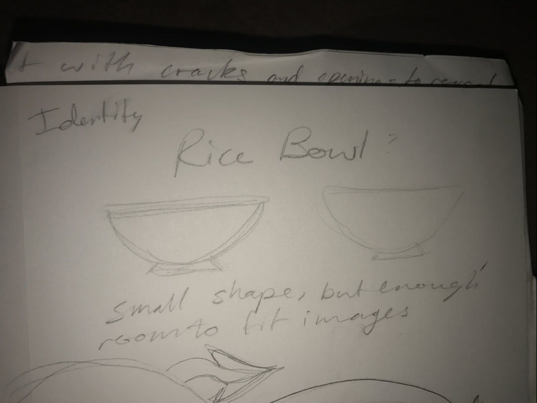
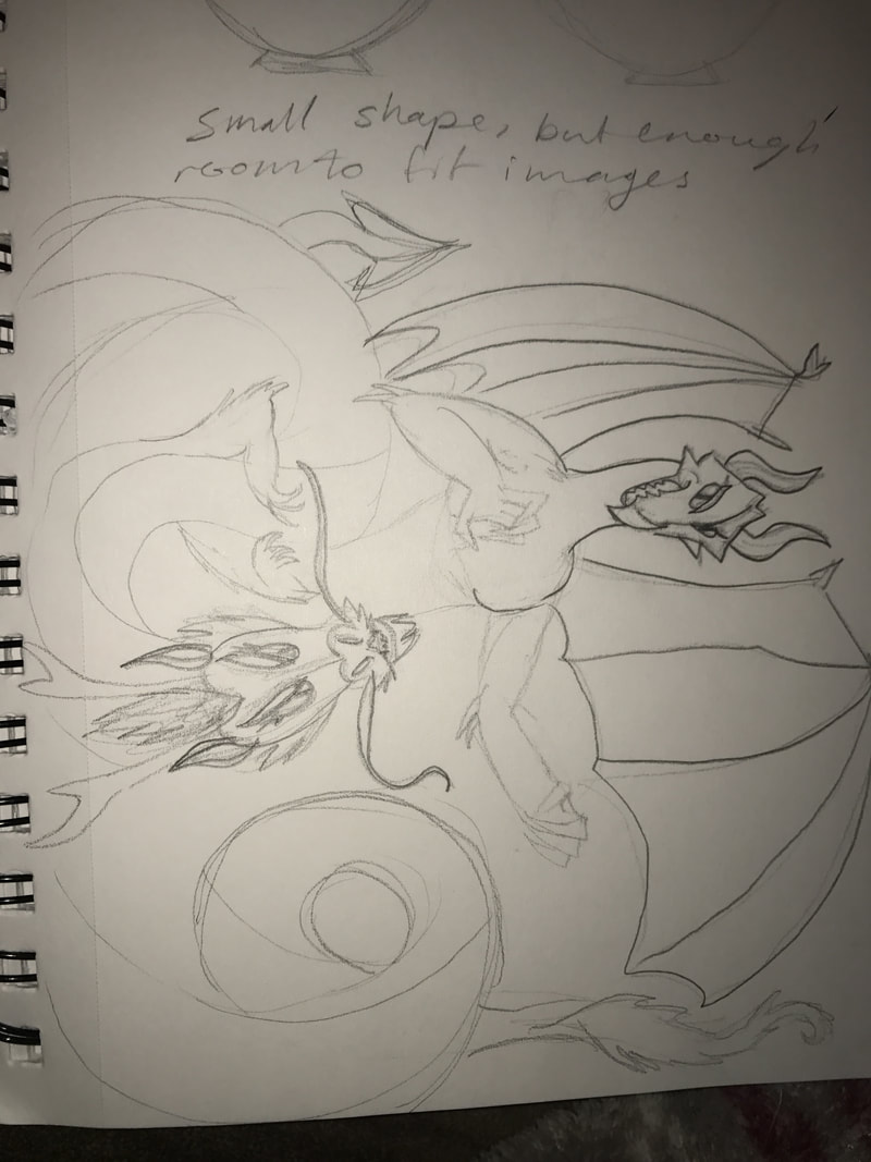
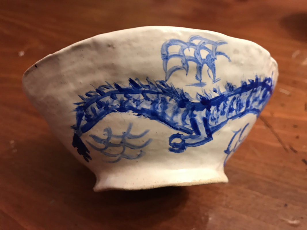
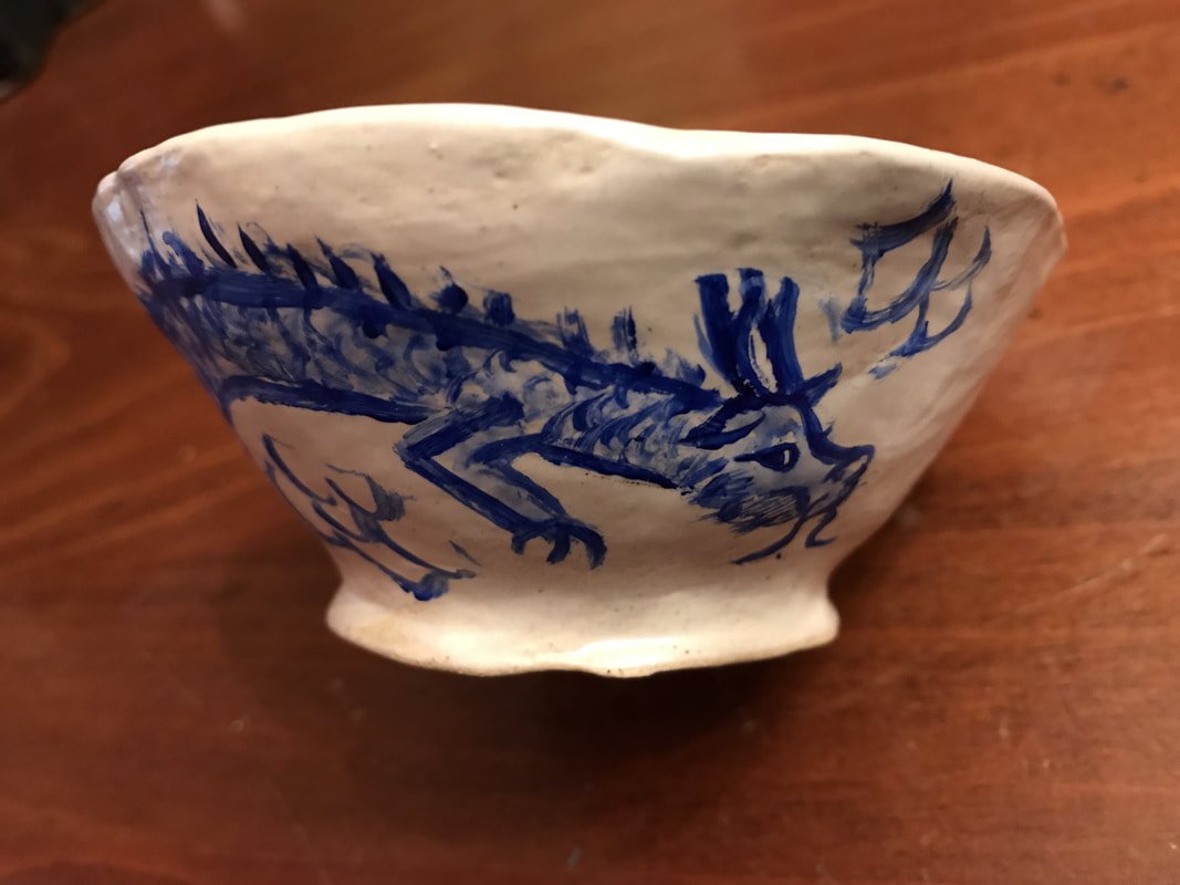
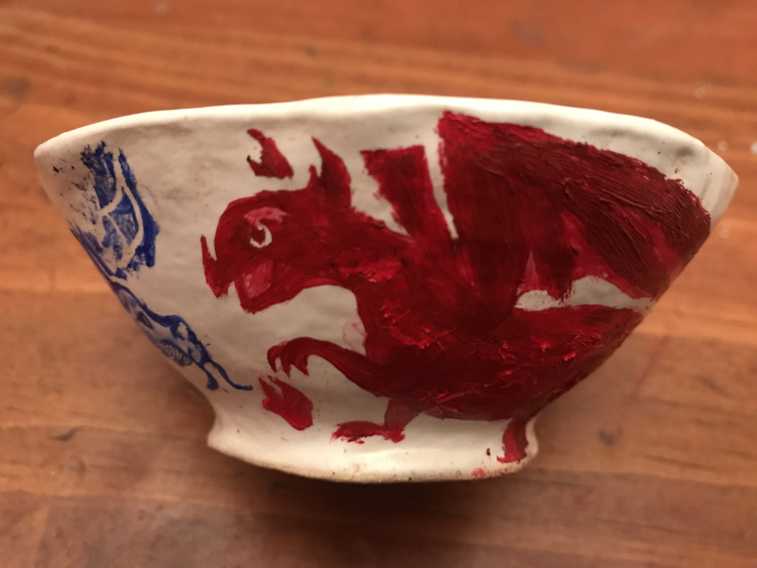
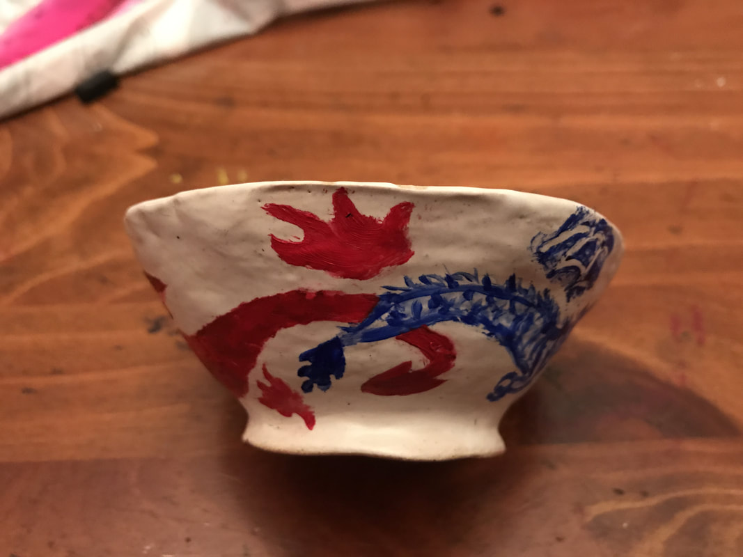
#2: Identity!My next project represents the theme of identity, or more specifically, cultural identity. I wanted to have an East meets West vibe, and combine the beauty of Eastern pottery with representations of both the East and West. I planned to make a small serving bowl, and decorate it with a blue Eastern Dragon (these are wingless; it will be either Chinese or Japanese-influenced for the design) and a red Western dragon (these have wings, and often breath fire. They will be portrayed in turmoil, to represent the vast differences between the identities and cultures of both sides of the world.
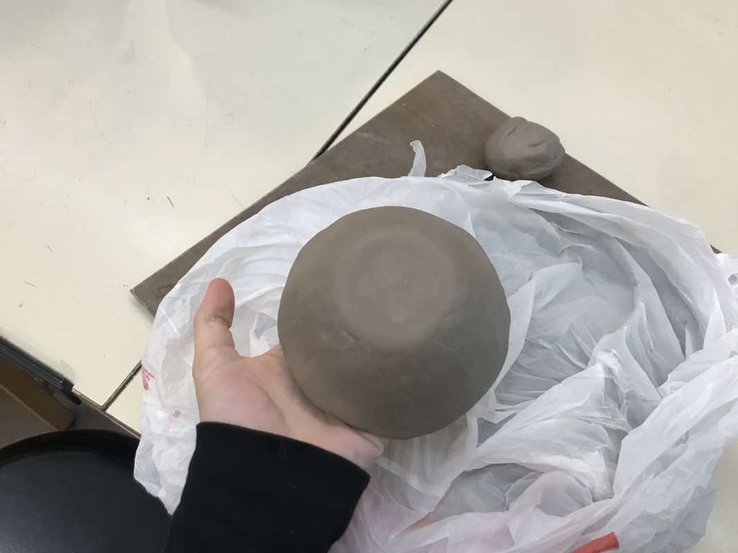
So far, I have wedged my clay and molded it to a base ceramic bowl. It is ergonomic due to its size - it fits in your hand at about the size of the average palm. I need to smooth the edges and make sure it is symmetrical, as well as thick/thin enough to survive the kiln in all areas. Once I have done this, I will leave it to become leather-hard, and then paint the background white, and the dragons with blue and red colored slip. I will cover it all with transparent glaze. Then, It will be ready to be fired, and hopefully all goes well from there! Update: For this project, my serving bowl is ready to be fired. Once it is fired I will apply a double coat of white glaze and fire again. Once it is finished in the kiln, I will paint the dragons onto it with acrylics. It was suggested to me that I do more than one bowl, so I was given a brief demo on the wheel. The bowl from the demo may be my second bowl, as I have not had an opportune moment/enough time to try the wheel for a second time. When I return from holiday break, I may attempt to use the wheel again to create my own, bigger bowl. I do not have any updated pictures of my current bone-dry bowl, or the larger bowl that was made by Mrs. Maclay. This project will likely take the longest to complete, with the process of firing involved. Update #2: I have the small bowl glazed and I have painted the first dragon on it. For the bowl, I only need to paint the second dragon and then varnish it to keep the paint from scratching off. The paint job so far still needs a few touch-ups, but for now, it gives the general idea of the style I was going for with this topic. I never made a second bowl, so to compensate, I was considering to make a tapestry with a similar image of the two dragons. That idea, however, is still brewing and it may never come into fruition. For now, here are two images of my glazed bowl with the first dragon. The project title is 'East meets West'.
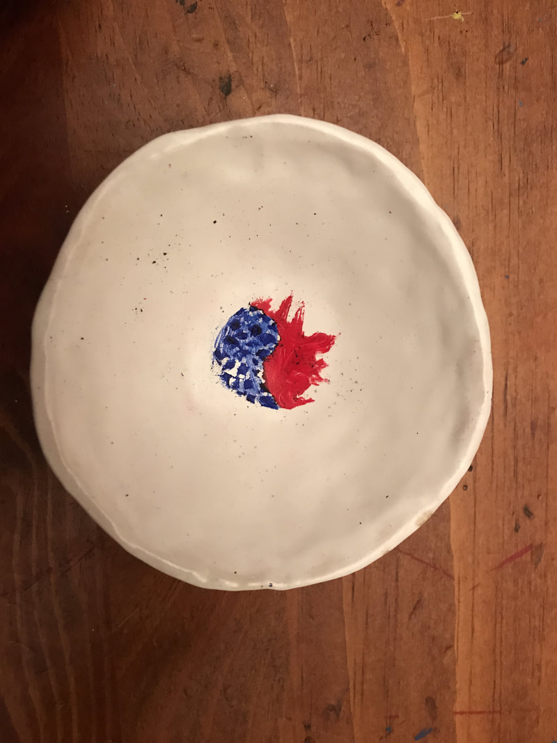
Update: I added the red western dragon, and I created a warm-cool contrast with the red and blue colors. Unfortunately, a lot of the acrylic paint tends to scrape off. The main concept of the piece is still there, with the fusion of two cultures. On the inside of the bowl, I made a yin-yang of fire and wind, the two elements that the western and eastern (respectively) possess.
|
Lanie Trudiana VevasisI am a current Junior at Shippensburg High School that loves all aspects of art. I am in no way an expert; however, I am constantly looking to expand my knowledge and experience. Archives
January 2018
Categories |
 RSS Feed
